


All Blogs
Innovative Ways to Incorporate Shades of Red into Your Home Decor
Feb
Welcome to the World of Red
Welcome to a world where the vibrancy of red breathes life into the heart of your home. As an interior design connoisseur, I recognise that incorporating the right shades of red into your dwelling not only elevates the style quotient but also infuses warmth, passion, and a dynamic energy into your living spaces. I come from a Middle Eastern background and as such, we love the colour red and all the shades that compliment with the gorgeous surroundings.
In this article, we’re exploring an array of innovative ways to splash different shades of red throughout your decor, from subtle accents to dramatic statements. Whether it’s through statement furniture, or the rich allure of red paint shades, I’ll guide you through balancing this powerful hue with your decor, ensuring a harmonious and inviting atmosphere.
Get ready to add some spice with pops of red accents, like throw pillows or rugs, against a monochromatic backdrop, or to craft a more sophisticated aura with deeper tones like maroon or burgundy.
Our journey through the palette of red will demonstrate how the right tint, saturation, and placement can transform your home decor. Join me and unlock the full spectrum of different shades of red in home decor for a space that’s not just designed, but also inspiring.
Exploring the Versatility of Red Paint Shades in Home Decor
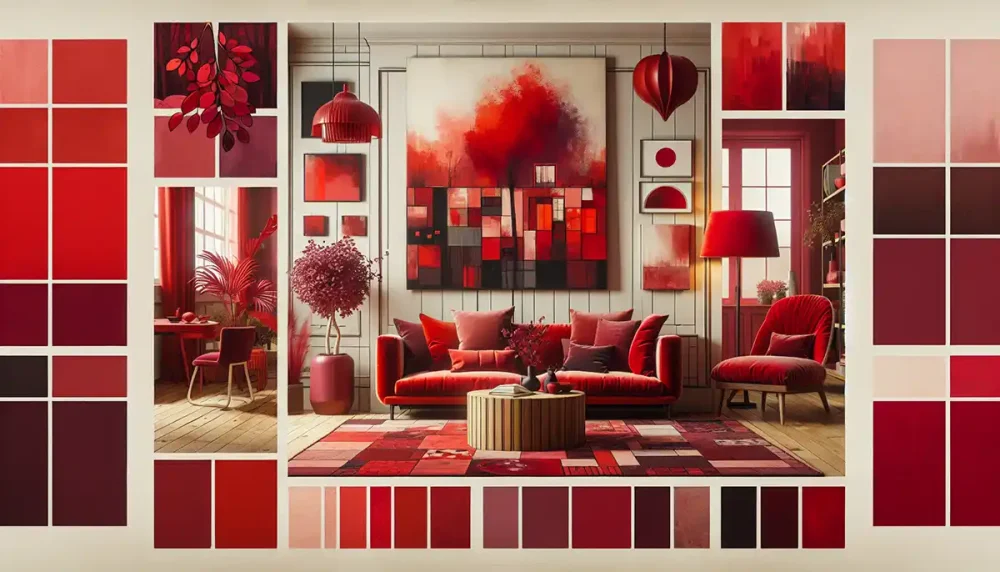
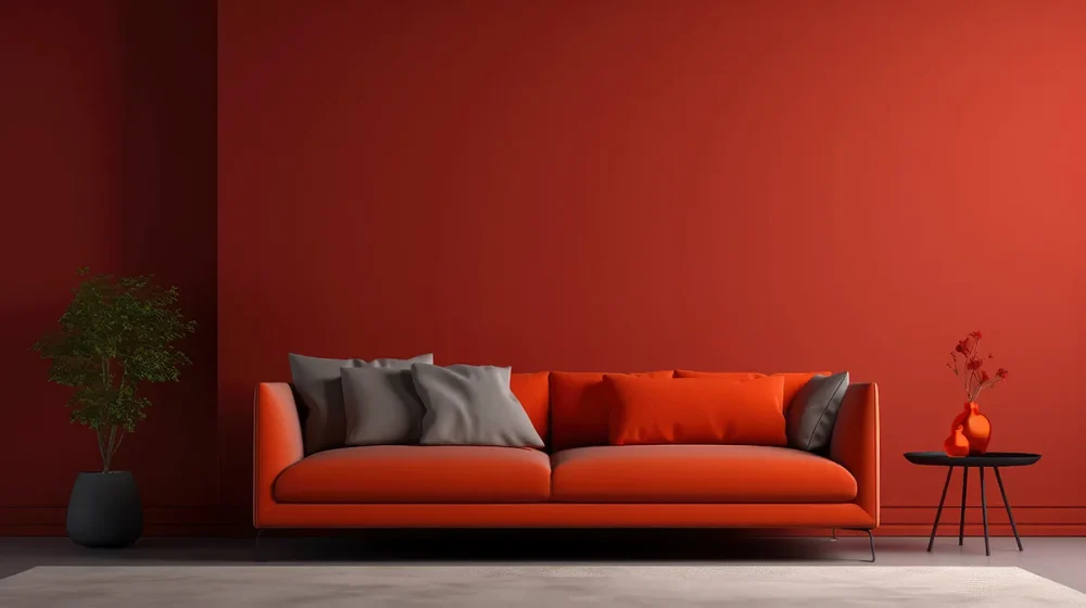
Delving deeper into the palette of warmth and intensity, different shades of red in the paint spectrum offer a vast canvas for creativity within home interiors. From the robust character of maroon to the infectious energy of blood red, each tint and tone of red bears its own persona, ready to transform any space with its charm. Let me guide you through the versatility that different shades of red bring to the table, ensuring you find the perfect match for your unique style.
The shades of red offer endless possibilities, from crafting an intimate atmosphere to electrifying a gathering space, each welcoming different moods and moments into your home.
In my experience, I’ve observed that red paint does more than just cover a surface; it envelops a room with a particular essence. Burgundy invites sophistication and lends a Mediterranean touch to decor, while lighter shades such as coral suggest subtlety and elegance. By weaving together the rich palette of different shades of red— you’re not just choosing a colour for your walls; you’re opting for an experience, a narrative that unfolds with each brushstroke. So, whether you’re contemplating a daring Blood Red for the dining; an empowering Caliente for the entryway; or an amiable Old Claret for the study, remember that the shade you choose becomes the storyteller of your space.
And let’s not forget, different shades of red are not mere background players. They engage in a lively dance with other elements in the space—furniture, textiles, lighting—to curate a dynamic and cohesive interior story. So, embrace the spectrum of reds, from the faint whisper of a blush tone to the assertive shout of an exotic red. As I’ve discovered in my decor adventures, reds have the profound power to evoke passion, set atmospheres, and make powerful statements that resonate through the heart of a home.
Innovative Ways to Incorporate Red into Your Living Space
Red isn’t simply a colour; it’s a statement, a feature that can turn any room from regular to remarkable. I often advocate for using different shades of red innovatively throughout the home to create spaces that are as unique as they are inviting. Here’s how I infuse this potent hue into various living spaces:
- Alcoves & Bookcases: Small spaces offer a great canvas for experimentation. Painting pantry shelves or the inner walls of a bookcase with vibrant shades of red immediately draws the eye and injects depth. It’s a masterstroke for those who appreciate attention to detail in their home.
- Anchoring Accents: Ever thought about the daring it takes to use red as an anchor in your decor? Well, the courage pays off gracefully. A splash of red detailing, like a pair of glossy red-painted paneling, could be that chic touch that elevates a room from ordinary to spectacular.
- Depth in Dining: When it comes to formal dining rooms, I find that deep, vibrant reds create a space that’s not just about sharing a meal; it’s about sharing an experience. Imagine a dinner surrounded by walls bathed in a shade like maroon, creating an atmosphere that’s both intimate and luxurious.I’ve found that the different shades of red reflect distinct styles and moods. For a contemporary edge, bright and vivacious reds work like a charm. And for a touch that says style and sophistication, bolder shades that make a statement are your best bet.
Here’s how I love to incorporate red into living rooms:
- Choose a Signature Red Wall: It’s a simple yet daring way to add a pop of colour. I always suggest thoroughly researching and testing the exact shade before going all in. Adding base coats can also assure that you achieve the shade you desire, without any underlying tones sneaking through.
- Complementary Colours: Pair red with contrasting colours to balance the vibrancy. Complementary greens, calming greys, or serene blues can harmonise with red without losing any of its impact, adding sophistication to its boldness.
- Artful Accents: For a subtler approach, red can make its mark through art pieces, decor, or even small furniture items like a striking armchair or side table. This approach ensures the room stays lively without the colour overwhelming your senses.Lastly, bold doesn’t mean brazen. The right tone of dark, saturated red, like maroon, can bring in a serious but stylish feel when complemented with white, earthy tones, or wooden features. And for the moments when you seek to be anything but conventional, painting living room doors red can offer a flamboyant twist that’s both exciting and exquisite.
As I constantly remind my clients, red is a testament to boldness, a colour that says you’re confident and courageous. Using different shades of red in the correct environment can transform it from intimidating to inviting.
Be it the playful vibrancy of a cerise or the understated elegance of a burgundy, the shades of red you choose tell their own story and proclaim your design prowess.
FAQs
In my journey of transforming homes, I’ve encountered numerous queries about the deployment of shades of red in decor, demonstrating curiosity and a desire to tread confidently into the territory of this dynamic colour.
Let me address some of the frequently asked questions which may also resonate with your own ponderings:
- How can I choose the right shade of red that complements my home?
When selecting different shades of red for your home decor, consider the existing colour scheme and the amount of natural light your space receives. Bright, bold reds like tomato or scarlet can energise a well-lit room, while darker tones such as maroon add a touch of sophistication to rooms with less light. - Is red too overpowering for small spaces?
Not at all! In fact, red can be used wonderfully to create focal points even in the smallest nooks. A crimson ottoman, a cluster of ruby throw cushions, or a garnet lampshade can become accents that enhance rather than overpower. It’s about finding the right balance and using shades of red as strategic highlights. - Can red work in a minimalist design?
Absolutely! The trick lies in selective placement. Use one standout piece in a minimalist room, like a bold, statement art piece, to imbue character without cluttering the aesthetic. Trust me, when done right, different shades of red can seamlessly integrate even into the most pared-back design.Remember, incorporating shades of red should be an exciting design adventure, not an overwhelming task. I encourage you to play with textures and patterns within your chosen shades of red to add depth and interest. And always be mindful of the mood you want to create, be it a lively, stimulating environment or a cosy, snug retreat.By using keywords such as “shades of red” and “different shades of red” throughout your queries, you’re already on the right path to creating a search-friendly decor narrative that’s as captivating as it is clickable.
Don’t hesitate to reach out for advice if the plethora of shades leaves you perplexed; I’m here to steer your palette in the most pleasing direction. Whether you’re going bold with your choices or dipping a toe into the red spectrum, my aim is to ensure that you stride with confidence and a sense of informed style.
Our team at Palatine Paints have helped thousands of our customers choose the right shade of colours, with my advice above and our colour matching service, including the ability to choose from different colour charts – we are sure to get the exact shades of red that you’re looking for!
Conclusion
In conclusion, we have traversed the arresting landscape of red and its versatility within the realm of home decor. From the passionate embrace of maroon in a cozy corner to the striking confidence of scarlet in a minimalist setting, the different shades of red offer not just a visual feast but an experience that resonates with the depths of human emotion.
Our journey through various applications underscores the power of this fiery hue to transform spaces into arenas of warmth, vitality, and sophistication.
We leave you with the understanding that the strategic deployment of the red spectrum can narrate the story of your space with both flair and finesse. Whether as a bold statement wall or a subtle accent piece, the shades of red are a testament to your design courage and personal style.
Remember to tread with balance, embrace the warmth and boldness it brings, and let the hues of red bedeck your home with a story that’s uniquely yours.
Popular Products
Driveway Paint
Bathroom Paints
Emulsion
DIY Paint
Palatine Paints
Decorative Paint
Anti Condensation Paint
Contacting us is easy!
Email: sales@palatinepaints.co.uk
Call Us: 01942 884 122
Contact form: https://www.palatinepaints.co.uk/contact-us
Live Chat Service: Press the small blue icon at the bottom left of your screen.