


Jan
Should you base it on mood, style, fashion, personal preference or good old practicality? Colour supposedly affects your mood, but scientific evidence is really inconclusive on this.
Anyone who’s studied marketing will know that in branding and advertising, colour choice plays a huge role. Similarly fashion has a big influence on colour choices, the garish browns and oranges of 70s décor, were replaced by the greys, burgundies and pinks of the 80s.
Rumour has it that the shades of grey so prominent in recent years are soon to be replaced by beige, honey, nude and pinks.
There are heaps of things that can or should influence your choice of colour as well as mood. For example, the kind of natural and artificial lighting the room gets, whether the area requiring painting needs to be highly visible, or even whether it will show the dirt more easily.
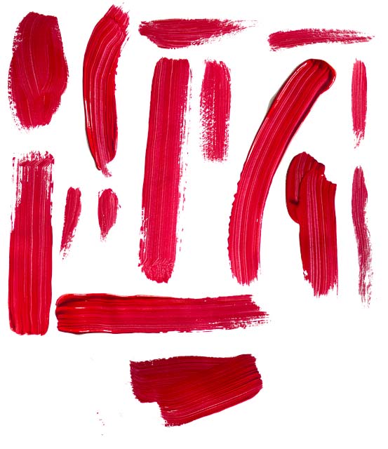
Colour: Red
Red is a truly versatile colour. Associated with danger and urgency, it is used on warning notices and prohibitive street signs… ‘No Entry’ etc.
Because of this urgency factor link, red is also great for sales promotions, encouraging buyers to move quickly. Moodwise, red is associated with aggression, energy, passion and enthusiasm. So which rooms to paint red? If you want to create a calm and restful space, red perhaps isn’t the colour to choose. Because red paint also comes in warmer, autumn shades however, it can make a space cosy and welcoming.
This is especially true if a room is large and has lots of natural light. Red apparently makes you feel hungry, so if you enjoy energetic conversation and entertaining, give it a try in the dining room.
Red: Room Style Matches
- Living rooms/Dining rooms – Combine with gold and mustards for a warmer, opulent feel. Or with grey, black or white for a smart look
- Playrooms – Use in small areas as seating, tables and picture frames, to provide brightness without overdoing it
- Garden – paint ornamental garden features and garden furniture for all year round, vibrant colour
- Where not to use – Dental surgeries, bedrooms (unless passion is more of a focus than sleep), study areas
Red Colour Fact – Post Office Red
A bright cherry red, post office red (official colour BS381 538) has been used on post poxes and post office livery since before most of our great grandparents were born. In fact according to The Postal Museum, the first pillar boxes were trialled in the channel islands 1852 at the suggestion of novellist Anthony Trollope who was working for the post office as a surveyor.
These original post boxes were red but in 1859 a standard was introduced so that all boxes were painted green. The green was so unobtrusive that people complained they were hard to find! It took ten years to paint all the post boxes back to red, and red they have remained ever since. Notable exceptions are the gold pillar boxes representing gold medallists at the 2012 olympics and the blue air mail boxes trialled in the 1930s.
Phone kiosks operated by the post office for decades after their introduction were also painted red. In the 1920s a combined post box/phone kiosk was introduced but only 50 of this K4 style combination phone box/pillar box/stamp machine were ever produced.
There are only 4 still in existence in 2019. Two of these are actually not far from Palatine Paints in the North West of England; one is located in Frodsham (pictured above) and the other in Warrington.
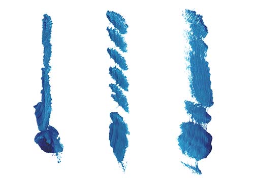
Colour: Blue
Blue is often linked with calm and tranquility but also integrity and innovation. A bright royal blue will however be less relaxing than something like a muted prussian blue, so shade is everything. In marketing, blue is used to indicate dependability, loyalty and innovation.
Successful businesses like IBM, Intel, Paypal and Facebook all have blue as the predominant colour in their branding. Blue therefore is a great colour to choose if you want to instil a sense of trust and build customer loyalty. Blue has featured less as a theme in interior décor fads than the greys, beiges and burgundies of previous decades.
It’s always a trusted classic however, that stands the test of time, working well with many other colours. Georgian decor with its elegant, rich, muted colour schemes featured lots of blue, in various shades from Wedgewood through to Navy and Gentian.
Blue still works well combined with crisp white coving and skirting. Which rooms to paint blue? Pales and turquoise shades work well in bathrooms indicating cleanliness and freshness. Richer shades are good for living and dining areas, while muted shades work well in bedrooms to give a restful atmosphere.
However if your room has low natural light or is north facing, opt for a lighter shade or restrict to a feature wall with darker blues.
Blue: Room Style Matches
- Living rooms/Dining rooms – different shades of blue can be combined to create an inviting space. Matching a duck egg blue with a navy might create a classy combination. While white, cream and grey are great for highlighting a beautiful shade like a Prussian blue
- Kitchens – the kitchen can cope with pale and bright blue especially combined with white. Blues on the greyer side like a pigeon blue can also work well especially if there’s easy access to outdoors where garden furniture colours can be coordinated
- Bedrooms – most shades of blue will work in bedrooms to create a restful space, but avoid overuse of darker shades if you don’t have much natural light
- Waiting rooms – dental surgeries, hospitals are obvious places for a calming, tranquil blue
- Where not to use – some shades of blue can be cold so may not be right where you want to create a warm, fun and energetic space like a playroom
Blue Colour Fact – Gentian Blue (RAL5010)
The colour Gentian Blue is actually used to describe all sorts of flowers but the Gentian (or Gentiana) itself has beautiful trumpet or salver shaped flowers and narrow green leaves. The spring gentian pictured is a small evergreen perennial which creates an amazing show of colour in late spring and early summer and is quite rare to see in the UK.
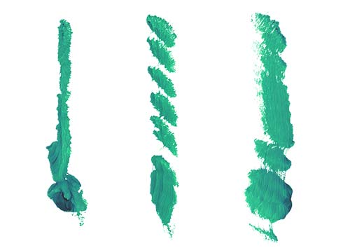
Colour: Green
Green for envy? Green for the environment? Green is a complex colour, but in terms of décor is often seen as a colour that encourages positivity and well being. It’s a great all round colour, coming in so many shades, with muted olives and sage shades for tranquility and bright limes and emeralds for refreshing.
Consequently, green can be used in most rooms in the home. Choose just the right shades to balance the mood you most want promote, or which will make the most of natural light sources.
In business, green is seen as a wise, decisive colour. Great for putting people at ease and instilling loyalty. It’s used in many brands associated with leisure, the outdoors and the environment; notable examples are Landrover, Spotify, Holiday Inn and the Forestry Commission.
Green: Room Style Matches
Almost any room in the home – gets the green light go ahead. Pale willows and mints work for bathrooms, while bright pistachios and limes are great for kitchens and playrooms. Beautiful earthy sages, olives and sea greens work just as well as softer shades for other rooms or combine them both in the same room!
Where not to use – depending on the shade, there isn’t really a no-go area for this colour.
Green Colour Fact – Brunswick Green (BS2660-6074 mid & BS 381C 227 deep)
The name for the pigment in the colour Brunswick green comes from the town of Braunschweig in north central Germany. The English name for Braunschweig is Brunswick. The pigment was manufactured there originally. It is a dark green which varies slightly in shade (hence mid and deep brunswick green). Sometimes it’s referred to as English green and the deep Brunswick green colour is recognised as part of the famous “British racing green” spectrum.
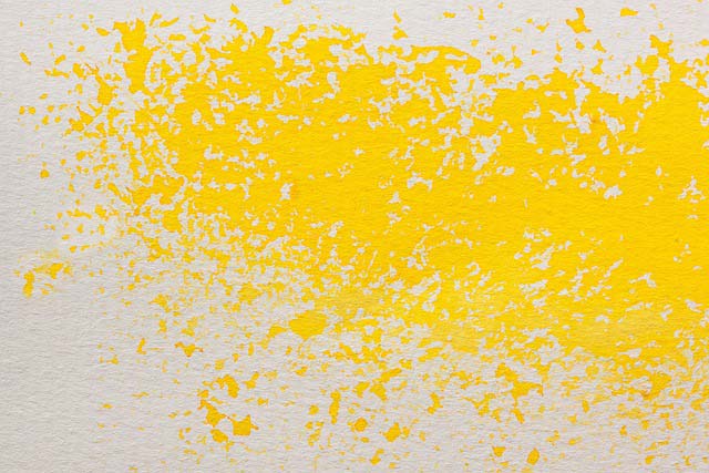
Colour: Yellow
Yellow is often seen as a cheerful and warm colour, linked with sunshine, sunflowers and fluffy chicks. Also sometimes associated with fear and timidity…yellow does feature in the phrase ‘cowardy custard’. Yellow can stimulate warmth and happiness in brighter shades, while paler yellows can have the same effect with more subtlety.
In marketing, yellow is often used for food branding (as in the MacDonalds arches) and is seen as an appetite stimulant. It’s also used as a cautionary colour…think of the yellow flag in a formula 1 racing, or on yellow road diversion signs.
Yellow is also seen as solid and dependable colour indicating a presence that can’t be ignored – JCB is great example.
Yellow: Room Style Matches
- Kitchens, bedrooms and hallways – yellow is ideal for a kitchen or bedroom where there’s not much natural light. Choose warm and cheerful for a country theme!
- Living Rooms – yellow can create a warm, cosy atmosphere in a living space, choose paler shades for relaxed ambience or bolder, mustards for a classic look
- Dining Rooms – as an appetite stimulant yellow is great for a dining space, choose rich, gold shades for a warm and welcoming vibe
- Where not to use – business premises, doctor’s waiting rooms!
Yellow Colour Fact – Canary Yellow (BS381 309)
Originating in the Canary Islands and surrounding regions, the canary is a member of the finch family, so is related to the goldfinches and chaffinches we see hopping round here in Britain. With its bright yellow feathers, cheerful nature and cute song, this bird has been kept as a pet since the 17th century. Actually, canaries are not all yellow, but can vary from green to orangey brown. Epitomised as the cute little “Tweety Pie” by Warner Bros, there is a more ghoulish side to the canary’s history. Canaries were used right up until the 20th century by miners as an early warning detector for toxic gases.
Further reading:
To read more about the link between colour and mood (and whether it exists) we suggest:
Does colour really affect our mind and body? Stephen Westland Professor, Chair of Colour Science and Technology, University of Leeds
Do colours really change our mood? Claudia Hammond, BBC Future.
Colour Matching
We offer colour matching on most of our paint products.
Contacting us is easy!
Email: sales@palatinepaints.co.uk
Call Us: 01942 884 122
Contact form: https://www.palatinepaints.co.uk/contact-us
Live Chat Service: Press the small blue icon at the bottom left of your screen.