


Colour
Embrace the Autumn Season with Captivating Colour Schemes for 2023
Sep
Autumn colours! With its mesmerizing array of colours, offers a wealth of inspiration for designers and colour enthusiasts. The transition from the lush greenery of summer to the fiery hues of Autumn provides a rich palette of oranges, reds, yellows, and browns. This comprehensive guide will walk you through the best Autumn colour palettes for 2023, ensuring you stay ahead of the curve in your design endeavours.
Understanding the Essence of Autumn Colours
Before we dive into the vibrant world of autumn colour schemes, it’s crucial to understand their significance. Autumn colours symbolize warmth, mirroring the natural world during this transition period. The hues of Autumn leaves and ripe pumpkins inspire these colour palettes, creating a sense of cosiness and richness that resonates with the season.
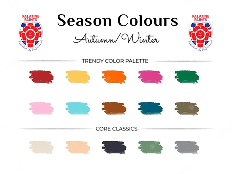
The primary colours associated with Autumn are orange, red, yellow, and brown, inspired by the changing colours of leaves. However, contemporary design trends have broadened this palette to include other colours like deep greens or muted blues, adding a fresh twist to the traditional autumnal hues.
The Emotional Resonance of Autumn Colours
While the colours of Autumn are technically warm, each hue retains its emotional connotations. For instance, red, often linked to power and excitement, maintains this association even in the context of Autumn. However, when multiple warm shades are combined, they create an overarching “autumnal vibe” – a sense of warmth and comfort that’s quintessential to the season.
Top Autumn Colour Palettes for 2023
Now that we’ve explored the essence of Autumn colours let’s delve into the top Autumn colour palettes for 2023. These palettes were carefully curated, keeping in mind the current and predicted design trends for the upcoming year.
1. Gold Luxe Look: Embrace the Richness of Autumn
Autumn is synonymous with warmth and richness, and what better way to embody this than with a luxe gold look. This sophisticated palette is dominated by shades of gold, complemented by fiery reds and burnt oranges. The result is an opulent Autumn colour scheme that exudes warmth and elegance.
2. Bright and Bold: A Fresh Take on Traditional Autumn Colours
If you’re not one to shy away from bold colours, this palette is for you. It combines vibrant hues like chartreuse, tangerine, and electric pink, offering a contemporary spin on the traditional Autumn colour scheme. The result is a lively, saturated palette that’s sure to uplift even the dreariest Autumn day.
3. Earthy Elegance: Connect with Nature
This palette draws inspiration from the tranquil, earthy tones of nature during autumn. It features burnt oranges, deep eggplant shades, and calming coffee tones, all combined to create a cosy, neutral look. This palette is perfect for those wanting to create a serene, inviting space that reflects the calming essence of Autumn.
4. Green Enchantment: A Different Take on Autumn
This palette takes a different route, focusing on the verdant greens that linger on as Autumn advances. The deep green walls, paired with rich reds and oranges, create a fresh yet cosy Autumn colour scheme. This palette is an excellent choice for those who wish to hold onto a semblance of the lush summer greenery, even as they welcome the autumn season.
5. Pink Palette: A Fresh Feel for Autumn
Pink may not be the first colour that comes to mind when you think of Autumn, but this palette proves that it can work beautifully for the season. The earthy, pink painted walls, complemented by patterned upholstery and a rich Autumn colour scheme, results in a room that feels fresh and inviting.
6. Dark Elegance: Cocooning with Deep Shades
This palette takes a bold approach, focusing on deep, rich colours like aubergine and chocolate brown. These hues create a cocooning effect, enveloping the room in a sense of warmth and comfort. It’s an excellent choice for those wanting to create a snug, inviting space during the colder months.
7. Neutral Sophistication: Layering Shades for Cosiness
This palette showcases how sophisticated beige and brown can be, especially when layered with other earthy Autumn tones. The result is a beautiful Autumn colour scheme that feels warm, inviting, and incredibly stylish.
8. Pattern Play: Let Your Prints Shine
This palette encourages you to let your patterns and prints take centre stage. By using a range of muted tones as a unifier, you can introduce a mix of patterns without overwhelming the space. This results in a unique, eclectic style that’s perfect for Autumn.
9. Blue and Orange: A Classic Combination
This palette combines bright blues with cosy shades of orange, creating a beautiful contrast. The result is a Autumn colour scheme that feels fresh yet warm, perfect for those who want to inject a bit of vibrancy into their autumn decor.
10. Deep Reds: Fire Up Your Autumn Palette
Deep reds are synonymous with Autumn, and this palette uses them to great effect. By pairing these fiery shades with calming neutrals, you can create a Autumn colour scheme that’s bold yet balanced.
Navigating the Best Colour Palette Generators
Creating your own Autumn colour palette can be a fun and rewarding process. To make things easier, consider using a colour palette generator. These tools allow you to explore different colour combinations and save your favourite palettes for future use.
Venngage’s Accessible Colour Palette Generator
Venngage’s Accessible Colour Palette Generator is a great tool for creating Autumn colour palettes. It generates a range of beautiful, WCAG-compliant colour palettes that you can use in your design projects. This tool is free to use and requires no design experience or accessibility knowledge.
Colour Palette FAQ
What are the best Autumn colours?
The best Autumn colours are those that evoke the warmth and richness of the season. This includes hues like orange, red, yellow, and brown. However, modern design trends have expanded this palette to include other colours like deep greens and muted blues.
How can I use Autumn colour palettes in my design projects?
You can use Autumn colour palettes in a variety of ways. For instance, you can use them to create Autumn-themed marketing materials, refresh your brand’s visual identity, or even redecorate your home. The key is to choose a palette that resonates with your vision and complements the rest of your design elements.
Can I create my own Autumn colour palette?
Absolutely! Creating your own Autumn colour palette can be a fun and rewarding process. You can start by taking inspiration from the natural world during autumn, then experiment with different colour combinations until you find one that you love. Using a colour palette generator can make this process even easier.
Embrace the magic of the autumn season by incorporating these captivating colour palettes into your design projects. Whether you’re refreshing your brand, creating Autumn-themed marketing materials, or simply redecorating your home, these colour schemes are sure to infuse warmth and richness into your designs. So go ahead and experiment with these palettes, and watch your creations come to life with the vibrant hues of Autumn.
Contacting us is easy!
Email: sales@palatinepaints.co.uk
Call Us: 01942 884 122
Contact form: https://www.palatinepaints.co.uk/contact-us
Live Chat Service: Press the small blue icon at the bottom left of your screen.